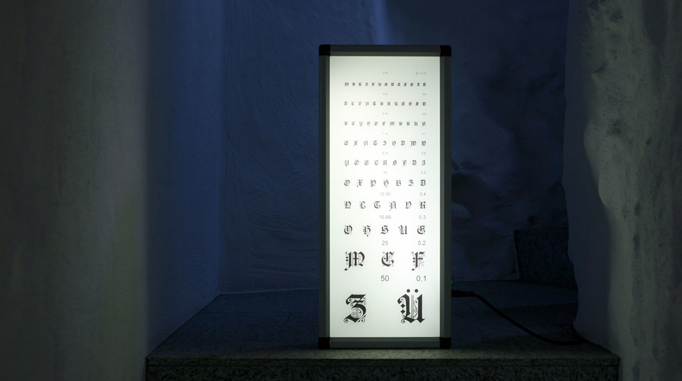
SCHWIZERDÜTSCH FOR BEGINNERS 2012
 Schwizerdütsch for beginners , 2012
Arriving in German-speaking Switzerland from abroad can be confusing. Depending on the canton, the Swiss-German
dialect can vary enormously and is in no way similar to traditional German
(Ruhrdeutsch). Accent, pronunciation, phrasing and vocabulary are like a kind of unstable material as you travel
around the country. And oral communication is made all the more complex by the fact that it is totally asymmetrical;
the native speaker will have little - if any - difficulty adapting to all the variations he or she may encounter,
while the visitor will quickly feel lost in the conversation. The Swiss German language is absolutely fascinating
because it has a musicality all of its own. But this musicality can quickly be perceived as an identity signature.
If you hear a passer-by say hello to you, depending on whether they opt for "Grüezi", "Grüess eech" or "Hallo",
you will already have an indication of where they are coming from.
In some remote places and valleys, the inhabitants are unilingual, so it takes a lot of inventiveness to make contact.
Coming from abroad, you have to find universal words and transform yourself into a pantomime. Pierre-Philippe Hofmann's visual work reminds us of this context.
At the end of the 1950s, after several years of frantic research, the Swiss typography duo Max Miedinger and Eduard Hoffmann created a
legendary sans-serif typeface, Helvetica. Because they systematically experimented with every combination of letters, they ensured that
the typeface was among the most functional. For some, it's a kind of typographic Holy Grail, writing reduced to its essential form.
For others, it's a smooth, disembodied typography.
In this piece, the artist highlights the discrepancy between tradition and modernity, introducing the Gothic character into an optometric test.